Matching A Book By Its Cover: A Visual Exercise
Some book covers beg to be stacked side-by-side. Like a Mariah Carey song, they belong together. Regardless of story or content, these covers complement each other so well visually, they should go on a date, get book-married, and have sequels.
This, my friends, is a book cover matchmaking, and here’s some of our favorites:
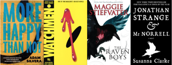
More Happy Than Not and Watchmen


One is a book about a teenager trying to find happiness, the other is a graphic novel about a group of washed-up superheroes. In this case, the smiley face means two completely different things in context to their stories. However, it is used in a slightly ironic way in both cases.
The Raven Boys and Jonathan Strange & Mr. Norrell


Both of these books, funnily enough, deal with a Raven King—hence the ravens on the covers. These look great together not just because they both evoke a sense of magic beyond the covers, but because with one white and one black, you’ll have a veritable yin-yang symbol of fantasy.
Paper Towns and No Place to Fall


Both books are contemporary novels with a lot of heart, although the former is more about adventure and mystery whereas the latter is more about pursuing your dream.
The Night Circus and Water for Elephants


Both of these have a lovely red and black color scheme, especially on the spines—so they would look great together on a bookshelf. They also both deal with circuses in an earlier time period, although the first one takes on more of an ethereal feel with its magic and mysteries, and the second is grittier, darker, and more grounded in reality.
What are some complementary book covers that you've seen lately? Let us know at @QuirkBooks!

Tara Sim
Tara is the author of TIMEKEEPER (Sky Pony Press, Fall 2016) and runs on tea, cake, and the occasional latte. She can usually be found lurking in the wild foothills of the Bay Area writing books and wrangling cats. Follow her on Twitter: @EachStarAWorld.